【Pandas】備忘録-その2-
前回記事の続きで、pandas, matplotlib の使い方の備忘録です。
環境:jupyter notebook
import pandas as pd
import numpy as np
from matplotlib import pyplot as plt
%matplotlib inline
データの読み込み。
train= pd.read_csv("C:file/to/train.csv")

train
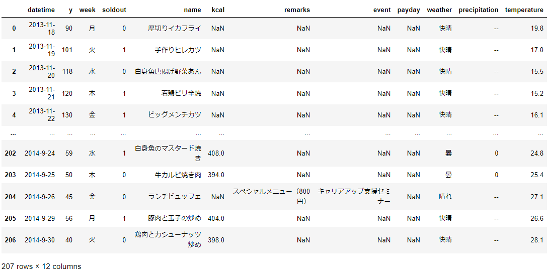
yの折れ線グラフを描く
- 折れ線グラフは plot 関数を使う。
train['y'].plot()
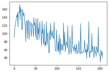
グラフを大きくする
- カッコの中にオプションとしてfigsize=(12,4)と書く。
train['y'].plot(figsize=(12,4))
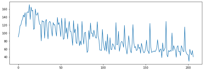
グラフにタイトルを付ける
- カッコの中に、title=““を記載。
train['y'].plot(figsize=(12,4), title="y")
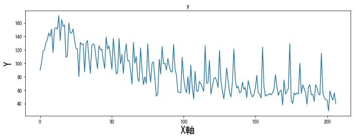
グラフのx軸とy軸に名前を付ける
#日本語文字化け対応
from matplotlib import rcParams
plt.rcParams["font.family"] = "MS Gothic"

ax = train['y'].plot(figsize=(12,4), title="y")
ax.set_xlabel("X軸", size=20)
ax.set_ylabel("Y", size=20)
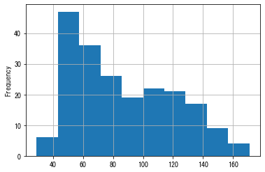
trainのyのヒストグラム
train['y'].plot.hist()

グリッド線を引く
train['y'].plot.hist(grid=True)
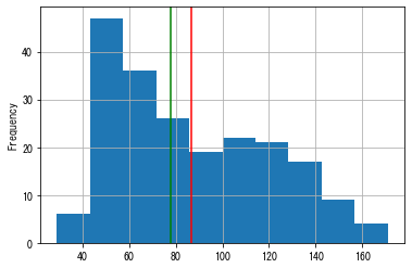
ヒストグラム上に平均値、中央値を表す線を引く。
train['y'].plot.hist(grid=True)
plt.axvline(x=train['y'].mean(), color="red")
plt.axvline(x=train['y'].median(), color="green")
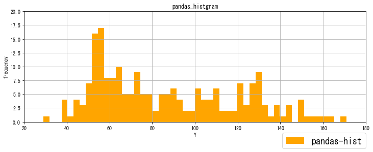
ヒストグラムのアレンジ
train['y'].plot.hist(bins=50, color="orange", grid=True, figsize=(12,4), label="pandas-hist")
plt.ylim(0,20)
plt.ylabel('frequency')
plt.xlim(20, 180)
plt.xlabel('Y')
plt.legend(bbox_to_anchor=(1, -0.1), loc='upper right',  borderaxespad=0, fontsize=18)
plt.title('pandas_histgram')
plt.legend() の loc の候補
- best
- upper right
- upper left
- lower left
- lower right
- right
- center left
- center right
- lower center
- upper center
- center
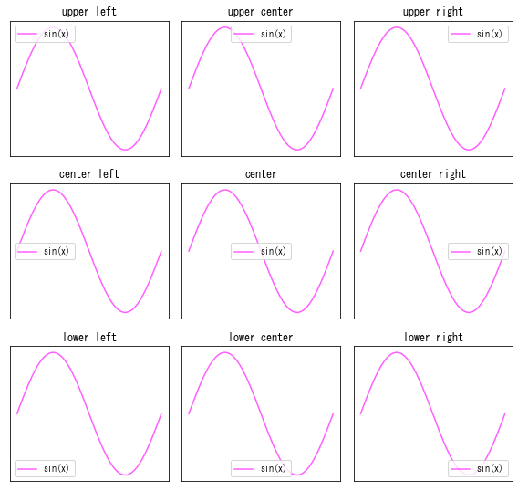
matplotlib の legend(凡例) の 位置を調整する
legend(凡例)について
Matplotlib plt.legend() | 凡例の位置とスタイル設定完璧ガイド!より、ほぼ引用。
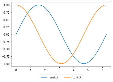
新しくsin,cos カーブのグラフを描きます。
x = np.linspace(0, 2*np.pi)
y1 = np.sin(x)
y2 = np.cos(x)

plt.plot(x, y1, label="sin(x)")
plt.plot(x, y2, label="cos(x)")

plt.legend(loc='upper center', bbox_to_anchor=(0.5, -0.1), ncol=2)
plt.show()
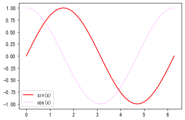
x = np.linspace(0, 2*np.pi)
y1 = np.sin(x)
y2 = np.cos(x)

fig, ax = plt.subplots()
ax.plot(x, y1, label="sin(x)", color="red")
ax.plot(x, y2, label="cos(x)", color=(1, 0.1, 1, 0.2))

plt.legend()
plt.show()
locs = ['upper left', 'upper center', 'upper right',
        'center left', 'center', 'center right',
        'lower left', 'lower center','lower right' ]

# 描画領域の調整、サブプロットのレイアウト自動調整
plt.figure(figsize = (8,10), tight_layout=True)

for i, loc in enumerate(locs):
  # サブプロット作成
  plt.subplot(4, 3, i+1)
  plt.plot(x, y1, label="sin(x)", color =(1, 0.1, 1, 0.7))

  # グラフタイトルの表示
  plt.title(loc)

  # 軸ラベルの非表示
  plt.xticks([])
  plt.yticks([])

  # 凡例の表示
  plt.legend(loc = loc)

plt.show()
以上になります。
お薦め
【コロナは茶番】中国人スパイの岸田首相、4回目のコロナワクチン接種9日後にコロナ感染 ゴルフ・温泉旅行を満喫、タイミングよく静養に入り夏休み延長